
03Accessibility · Visual systems · Communications2020–2025
U.S. House
Clarity for a
complex institution.
Using audience behavior, accessible design, and flexible visual systems to make institutional communication easier to understand—and more useful to act on.
- Role
- Visual & Graphic Designer
- Team
- Office of the Chief Administrative Officer
- Focus
- Email, digital, accessibility, events, reporting
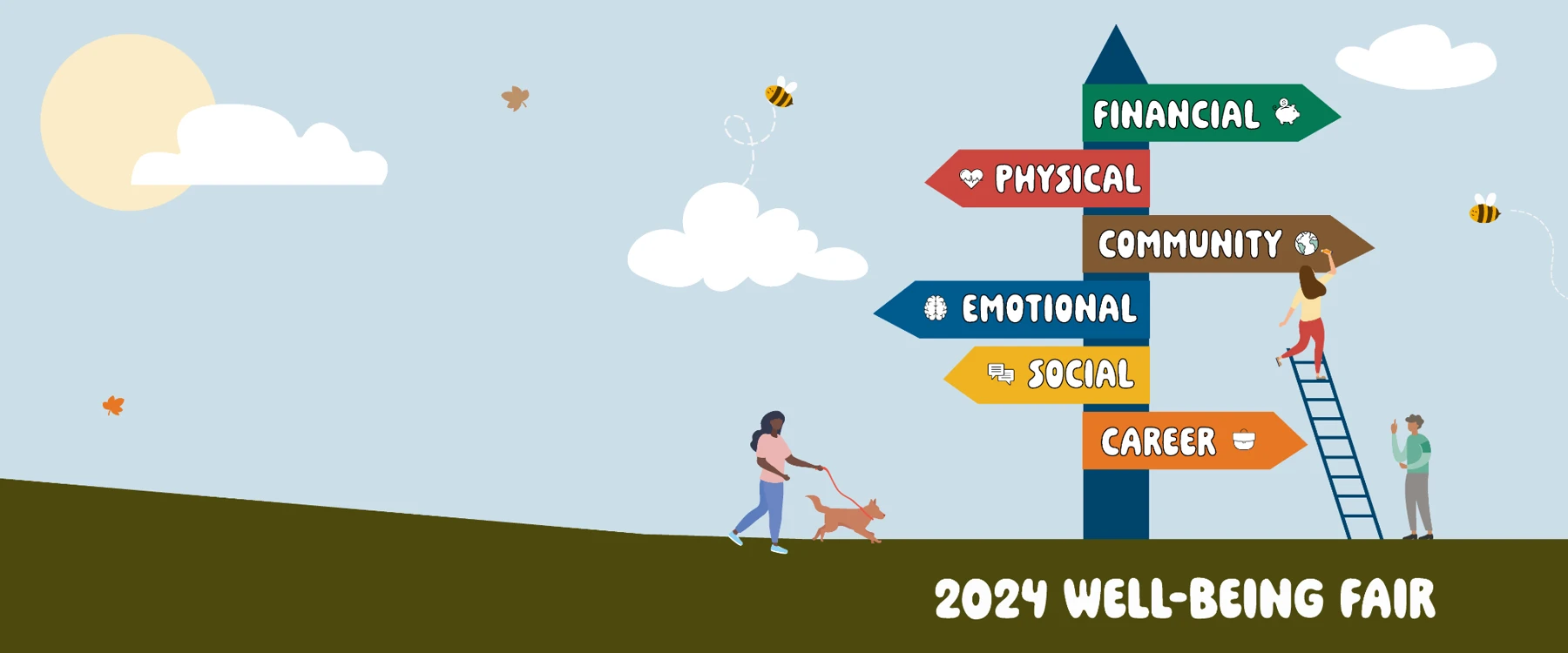
Original work / 2024 Well-Being Fair
A shared visual language across email, web, and events.
The opportunity
Make high-volume communications worth opening.
House communications had to work across a large, varied institution while remaining accurate, accessible, and fast to produce. For younger intern-level audiences, the question was more specific: what information were 18–23-year-olds choosing to open, click, and share with one another?
Reviewing open performance and topic-level click behavior revealed stronger interest in practical, immediate information—including food on campus and employee benefits. Those signals became inputs for the content hierarchy, subject strategy, and design.
Email redesign
Click behavior became a design input.
The redesign treated analytics as evidence, not decoration. Opens showed whether the message earned attention. Topic-level clicks showed what the audience considered useful. Sharing behavior revealed which information travelled beyond the original recipient.
Observed signal
Practical information earned attention.
Food on campus answered an immediate question. The design response was direct: descriptive subject language, scannable locations and hours, and a clear path to the useful detail.
- Lead with the task
- Surface location and timing
- Reduce the distance to action
House intern resourcesView online
This week on campusWhere to eat
and when.
and when.
Quick referenceLocations · hours · access
Topic interestHigher observed interest
Observed signal
Personal relevance increased the reason to click.
Benefits content became easier to use when eligibility, deadlines, and next actions were visible before secondary explanation.
- Use plain-language headings
- Prioritize eligibility and deadlines
- Make the next action unmistakable
House employee resourcesView online
Your benefitsKnow what is
available to you.
available to you.
Start hereEligibility · deadlines · support
Topic interestHigher observed interest
Design response
Time-sensitive content needed a shorter path.
Event outreach became more actionable when the value, date, and registration path appeared as one compact decision rather than separate blocks.
- State the value first
- Keep date and location together
- Use one primary action
Upcoming at the HouseView online
Save the dateOne event.
One clear action.
One clear action.
At a glanceDate · location · access
Topic interestCompared qualitatively
Design response
Complex updates needed stronger navigation.
Institutional content became easier to scan when it was broken into clear sections, supported by short summaries, and connected to descriptive links.
- Chunk by decision or task
- Write descriptive link labels
- Preserve context across formats
House administrative updateView online
What changedContext first.
Details on demand.
Details on demand.
Navigate by topicSummary · actions · reference
Topic interestCompared qualitatively
Interface reconstructions visualize the communication principles without exposing internal email content or audience data.
Accessibility
Clarity had to work for more people—and more contexts.
Contrast
Color combinations were evaluated for readable hierarchy across templates and screens.
Structure
Logical headings and content order improved scanning and supported assistive navigation.
Links
Descriptive actions clarified destination and purpose instead of relying on generic labels.
Responsive
Layouts were designed to remain legible across email, web, presentation, and print contexts.
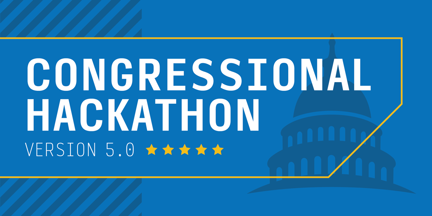
Event system
+39%One identity carried across the full invitation journey.
A recognizable visual language connected promotion, event information, presentations, and on-site materials—helping make a complex bipartisan event easier to recognize and join.
2024 Well-Being Fair
One visual language.
Many ways to connect.
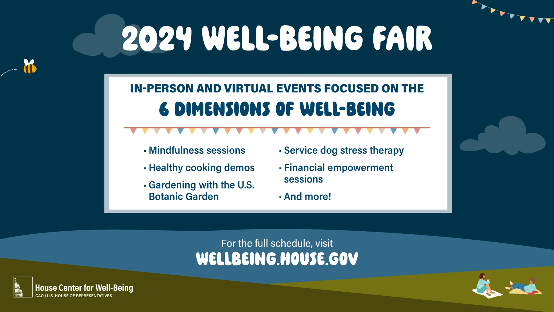
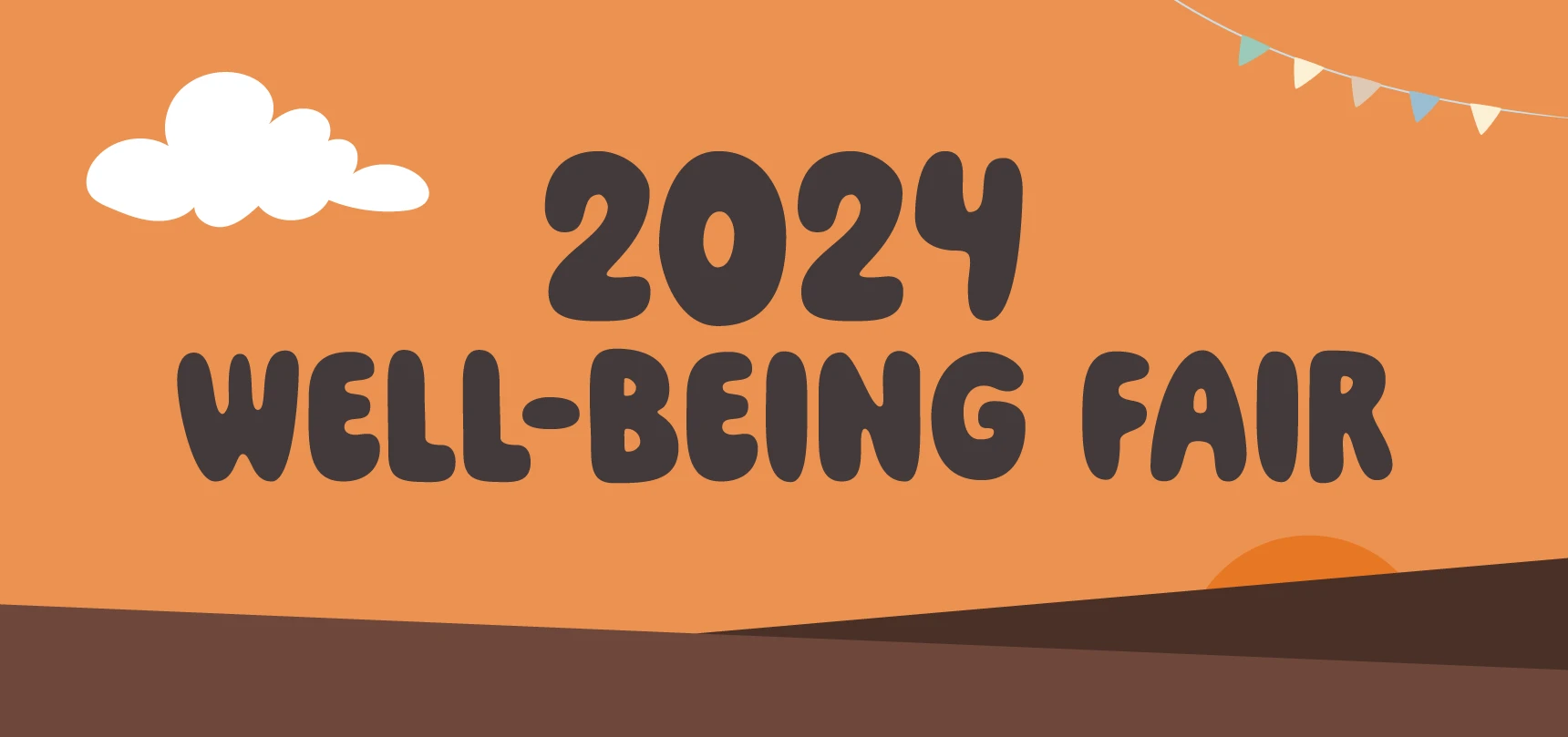
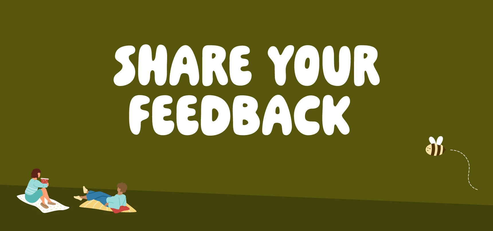
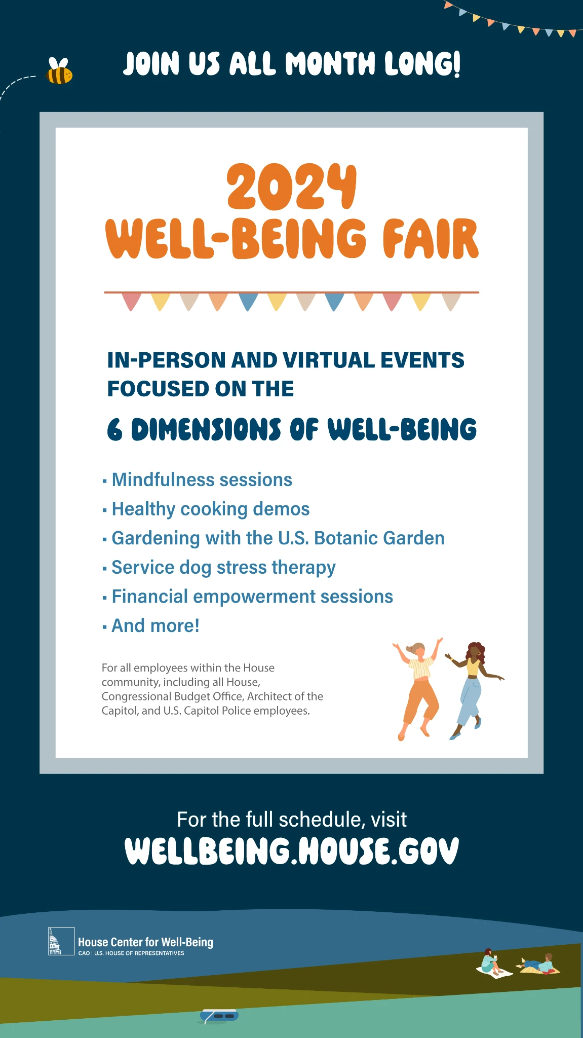
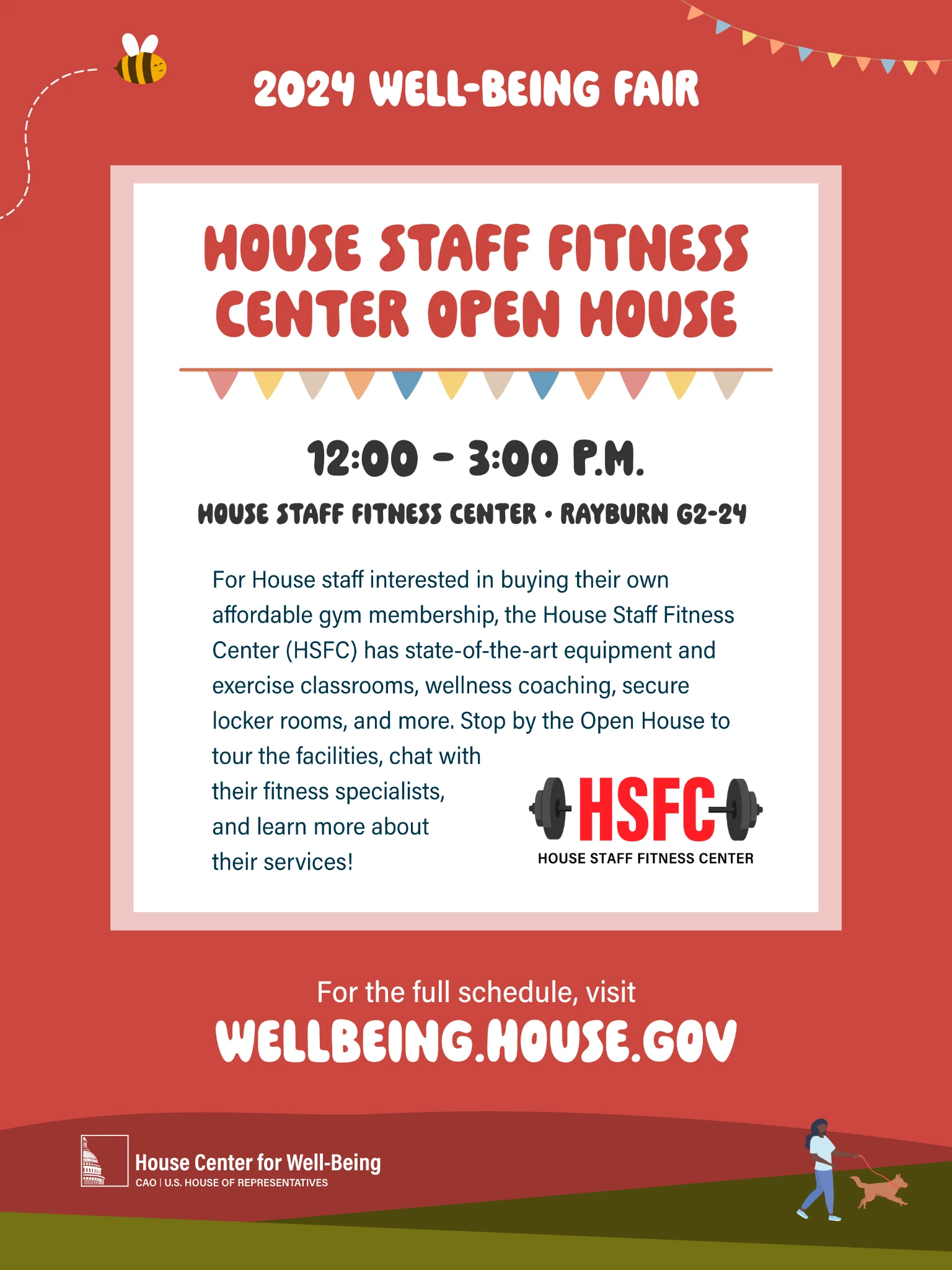
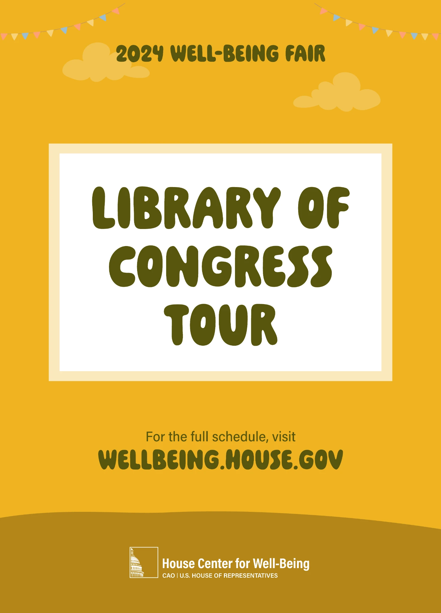
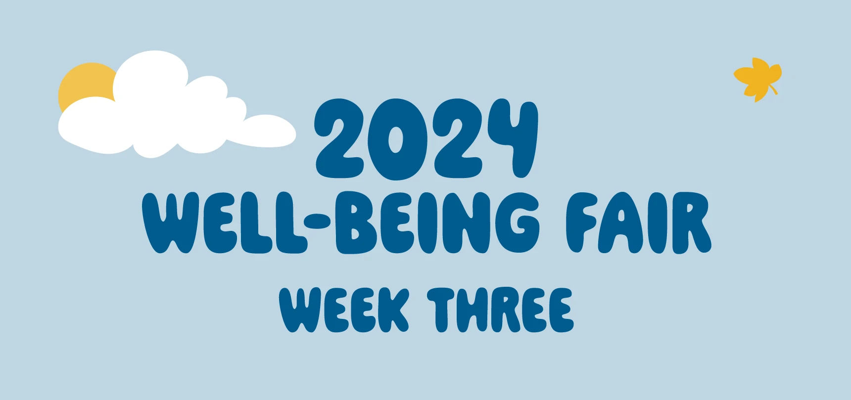
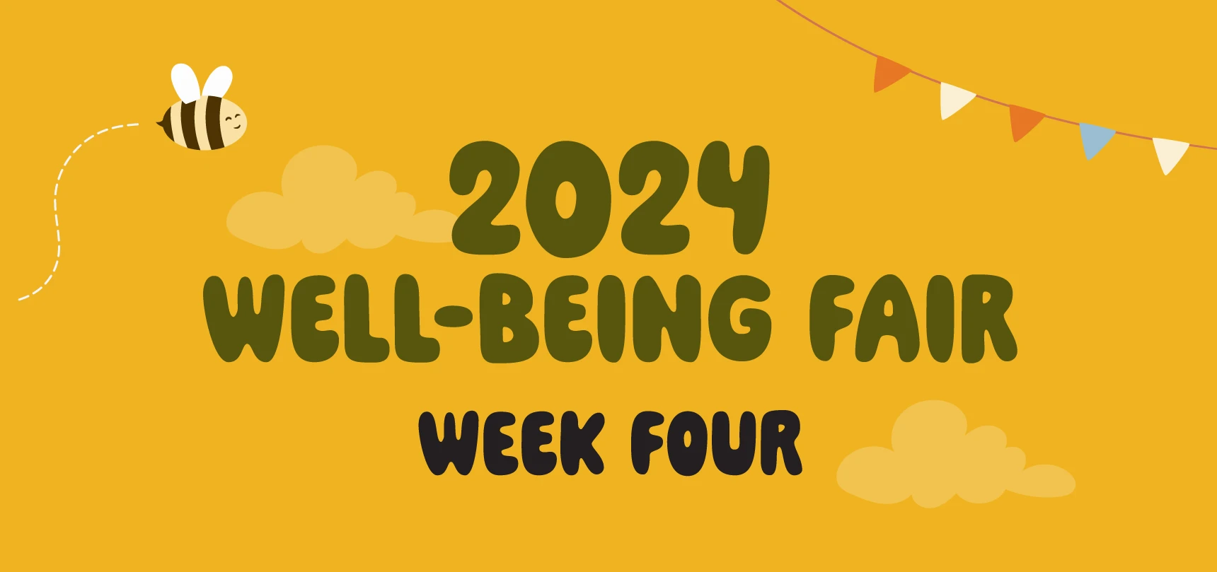
The Well-Being Fair identity carried across email, web banners, digital displays, posters, and easels. A shared illustration style and color palette connected the six dimensions of well-being while weekly headers distinguished each part of the program.
The original deliverables below show how the system adapted to different spaces and reading distances—from an email header to an on-site event sign.
Select a graphic to view the full image.